In a time of uncertainty and confusion it is more important than ever for there to be clarity in all global communications. The role that design has in reinforcing key messages in campaigns is more prominent than ever, and Design Week outlines exactly why we should harness this power that visuals have:
“Design is such a powerful tool, especially in the current pandemic – and typography and simple graphics or images with crystal clear messages are what’s needed. No frills, no nonsense language. Human, and with one rule for all. Design and a message that’s easy to remember and recognise”.
The key part of that quote for me is ‘human’, as this is a time where empathy is more important than ever, and that includes brands or organisations. Let’s take a look at the UK government for example. Now, it’s been suggested that through the confused communications and lack of consistency in what they’re saying, that they are lacking in empathy, and I’d have to agree. Furthermore, I’d argue they’re forgetting the bigger role that a consistent approach with design can play in uniting people, and thereby reinforce the messages they want to share.
We have seen some clever examples of brands educating and showing their compassion and understanding of their customers through design in recent logo tweaks and campaigns. McDonald’s, Coca-Cola, Audi and Volkswagen are just a few of the large corporations that are interpreting “social distancing” with logo redesigns, through moving elements of their logos elements further away to demonstrate their support.
Nike didn’t tweak its logo, but instead launched a visual social media campaign with its global roster of star athletes including NBA player LeBron James and golfer Tiger Woods. The campaign encourages people to stay inside with the statement ‘If you ever dreamed of playing for millions around the world, now is your chance. Play inside, play for the world.’
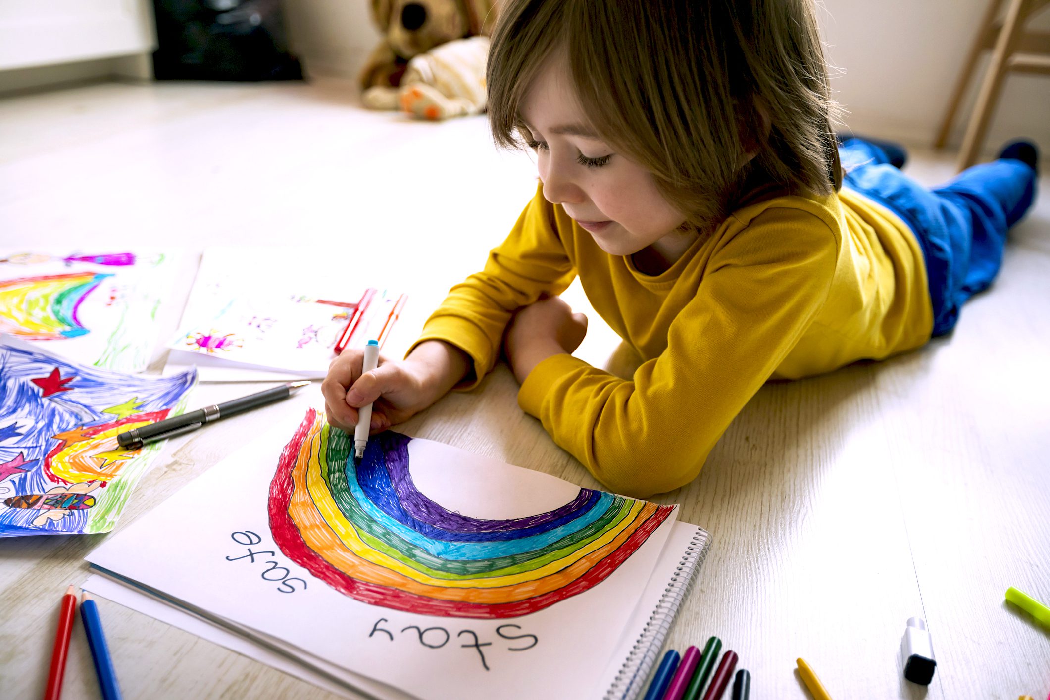
Finally, I also want to call out the rainbows that lots of children and families are drawing that can be seen in the windows of homes all over the country. Although not a part of any advertising, the rainbow has become a symbol of hope and unity, and illustrates how an image can speak louder than words.

Happy boy drawing at home. Social distancing. Quarantine .Covid-19 crisis.
So let’s make sure we remember to strengthen our campaigns through visuals and help provide clear and concise messages, not only throughout this time of uncertainty but in every campaign we produce.
https://www.designweek.co.uk/issues/23-29-march-2020/coronavirus-communications-government/
